Colour as Storytelling:
What the movies Frankenstein, The Substance, The Neon Demon, A Clockwork Orange and Suspiria have in common… a study in production design and colour. Sterile labs, clinical reds, saturated neon, Kubrickian symmetry: five films where the surfaces do the talking.
Before The(22)Studio, my background was in TV and film, and it’s left me with a habit I can’t switch off: I cannot watch a film or show without clocking an error in the set, props, or continuity; and once I’ve seen it, it ruins the whole experience. It’s not decoration to me. It’s information, and when it’s wrong, it’s the first thing I notice!
Take Stranger Things. Every single object on screen is aggressively, exclusively 1980s but that’s not actually how the 80s looked! Nobody could afford every single 80s toy the moment it came out, and this was long before cheap manufacturing made replacing everything easy. Real households were full of leftovers from the 70s sitting next to whatever was new. Strip all of that out and a show set in the 80s ends up looking less real than the actual decade did, it becomes a catalogue, not strictly the reality.
That’s the difference between set design that enhances a story and set design that takes you out of it. Done right, colour and set design should be invisible in the sense that you never question it; you just feel it… A palette tells you who to trust, what’s about to go wrong, whose memory you’re in, without you ever consciously clocking why…
Five films: two brand new, one already a decade old, all but the first (Frankenstein) reaching back to 1977 reference points, do this brilliantly, and watching them in sequence says a lot about where this technique came from and where it’s going.
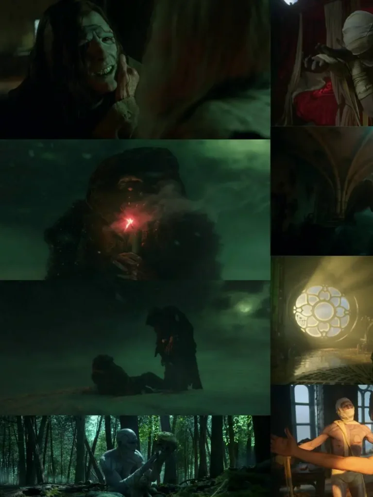
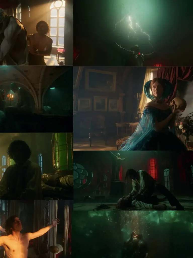
Frankenstein (2025) - colour as character :
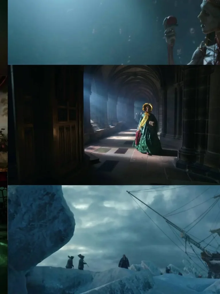
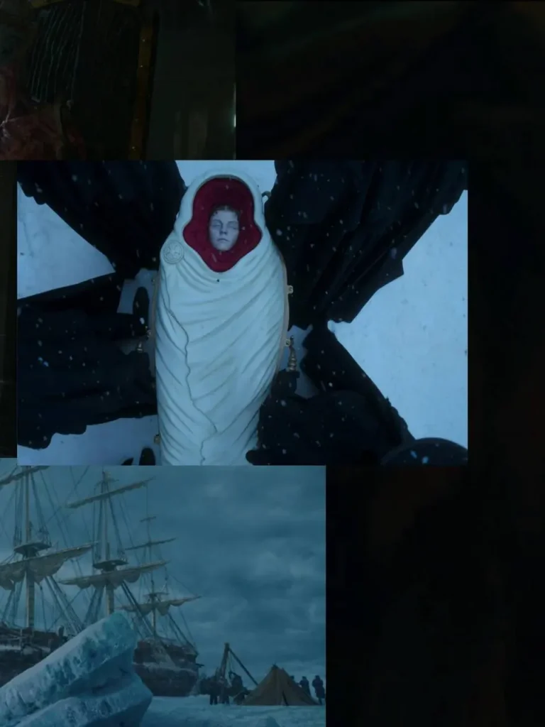
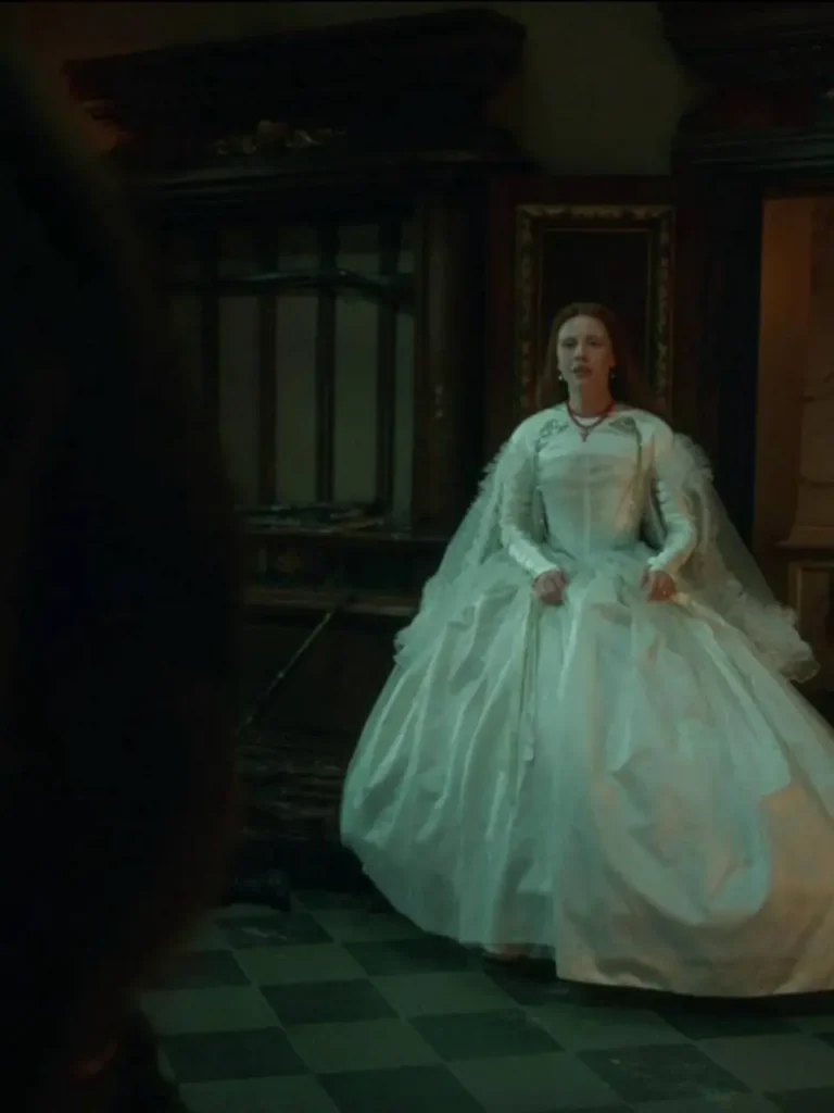
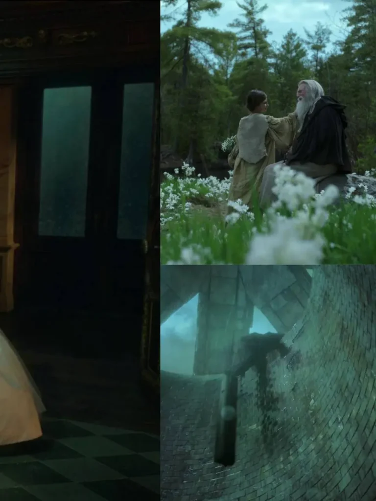
Guillermo del Toro‘s Frankenstein uses colour almost like a cast list.
Victor, Harlander and William, and Elizabeth are each tied to their own dominant hue, echoing the elements of fire, water and earth. Production designer Tamara Deverell and cinematographer Dan Laustsen built a full colour-coded system around Victor’s arc red for what he’s lost, gold for what he’s trying to reclaim, shadow for what he can no longer control.
Del Toro has described the approach as painting with memory: every colour choice is doing emotional work, not just visual work.
That’s colour used to make you feel for someone. A year earlier, a very different film used colour to split one woman into two..
The Substance (2024) - colour as duality :
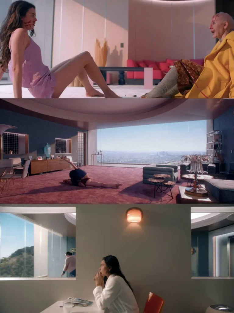
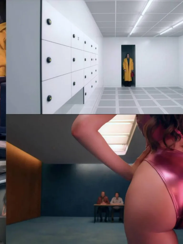
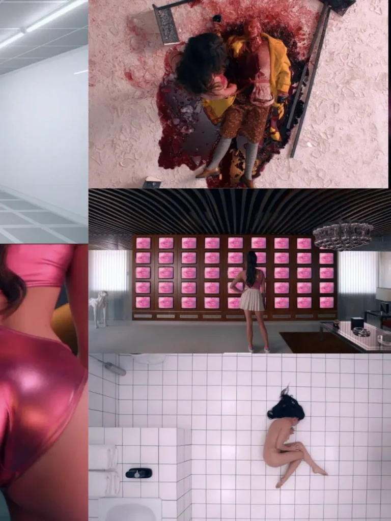
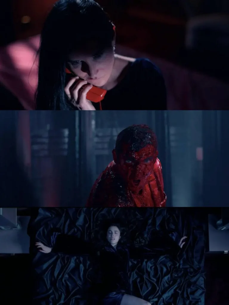
Coralie Fargeat and production designer Stanislas Reydellet split Elisabeth Sparkle’s world straight down the middle by colour.
Sue’s world the TV studio, the promo shoots, the “new” body lives in hot, saturated yellow: confident, artificial, aspirational.
Elisabeth’s world her flat, her bathroom, the version of herself she’s trying to erase – is all cold turquoise and clinical white, straight out of Kubrick’s playbook (the tiled bathroom is a direct nod to The Shining). Red is kept back almost entirely for the body horror, so when it finally floods the frame, it reads as violation rather than decoration. Two colour systems for one woman, and the film uses them to tell you exactly which “self” you’re watching without a line of dialogue.
That same idea – a beautiful surface with something rotten underneath – is exactly where The Neon Demon picks up.
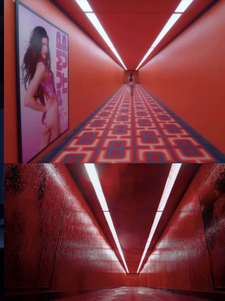
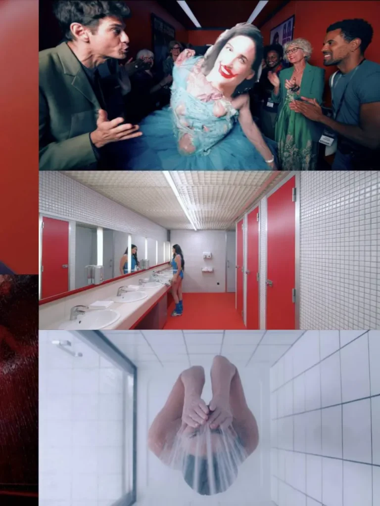
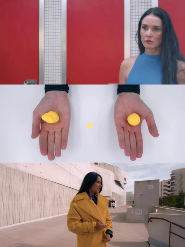
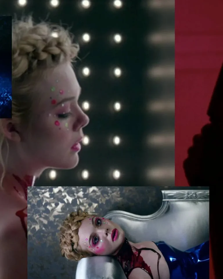
The Neon Demon (2016) - colour as threat :
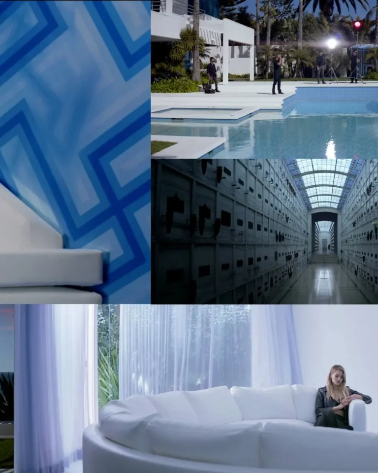
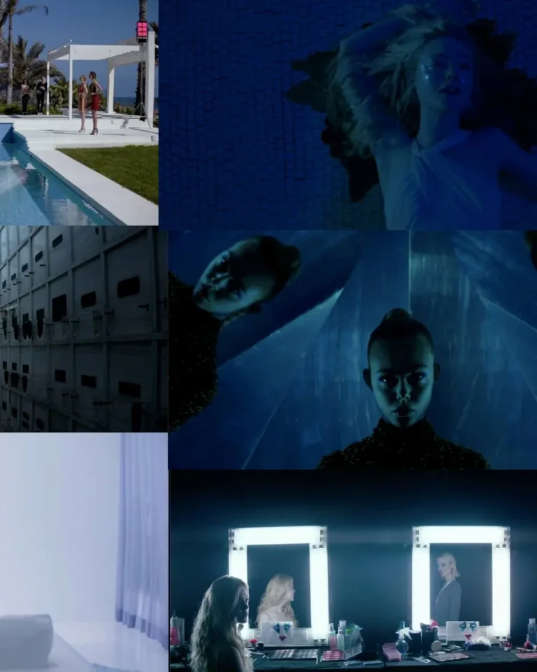
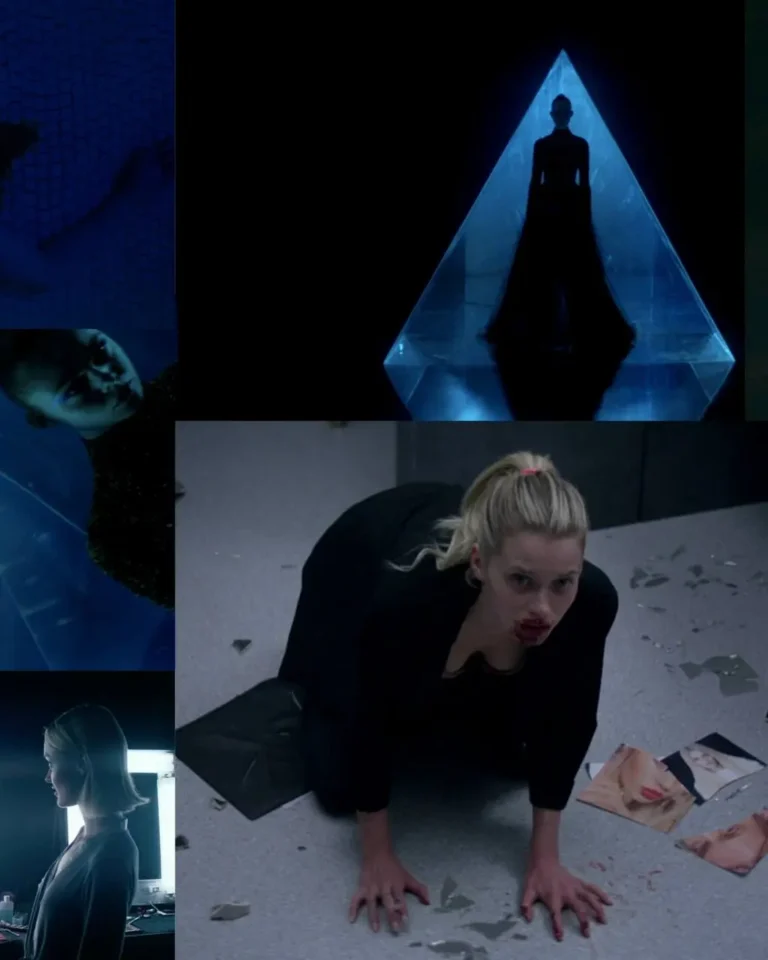
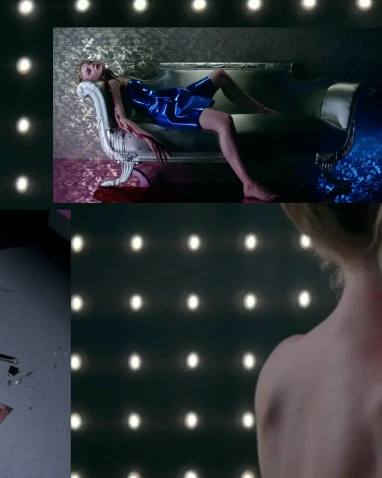
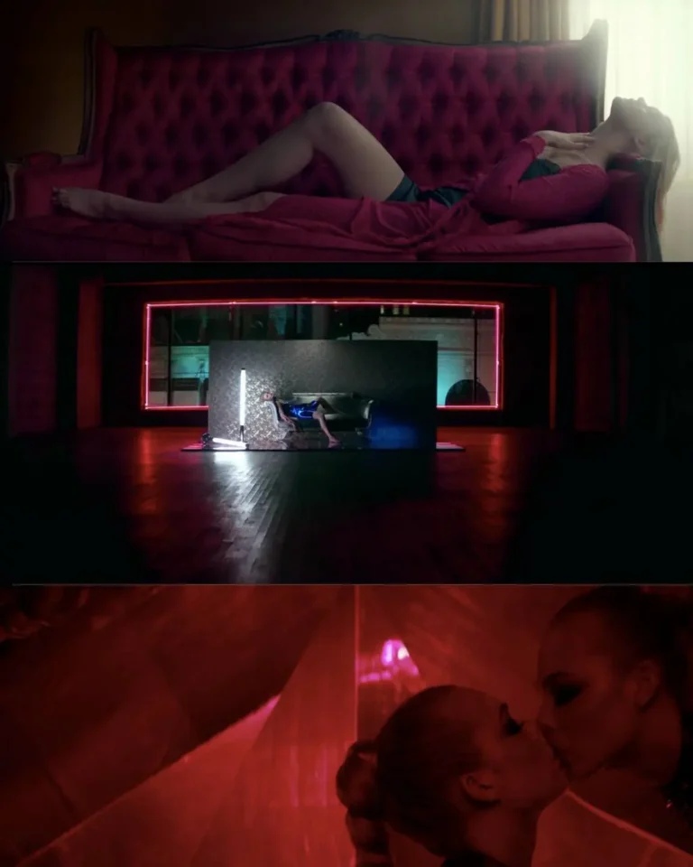
Nicolas Winding Refn’s palette here isn’t warm or emotional, it’s synthetic and cold. LA’s fashion world is lit like a nightclub; saturated pinks, blues and neons that make beauty feel dangerous rather than glamorous….
Mirrors, strobe lights, and triangular geometry recur throughout, turning every room into something closer to a ritual chamber than an apartment or studio. Even the “safe” spaces ; a motel room, a photographer’s loft , get bathed in the same unnatural glow, so nowhere in the film ever feels neutral. It’s a masterclass in using colour to create unease in a world that, on the surface, looks flawless – style as a warning sign, seduction and threat rendered in the exact same wavelength of light.
Refn didn’t invent that trick…. It goes back to a much older, much colder film about beauty turned menacing.
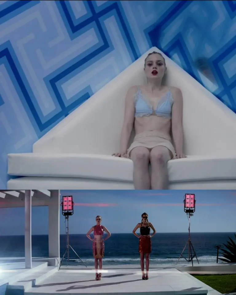
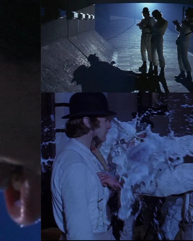
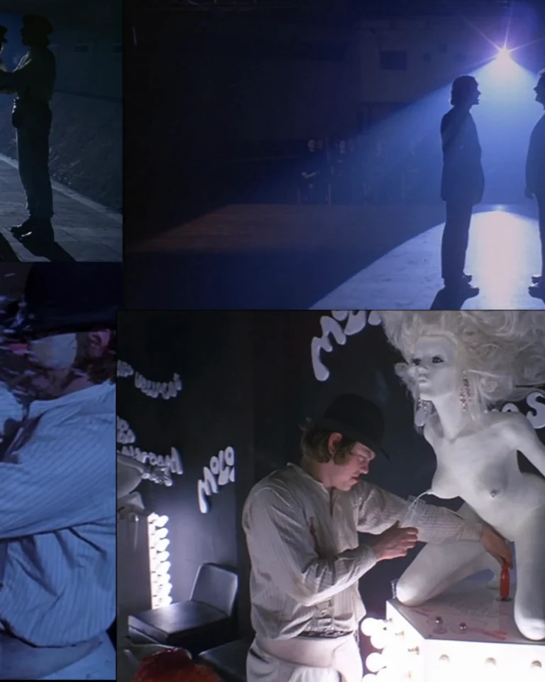
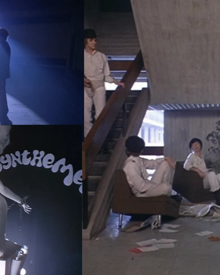
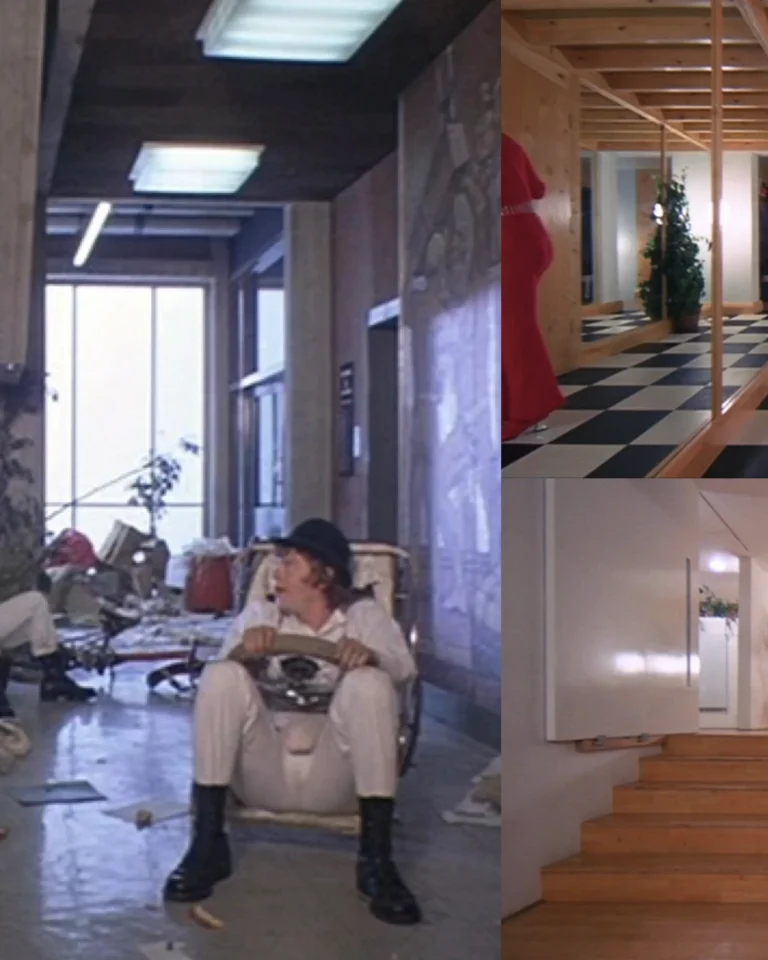
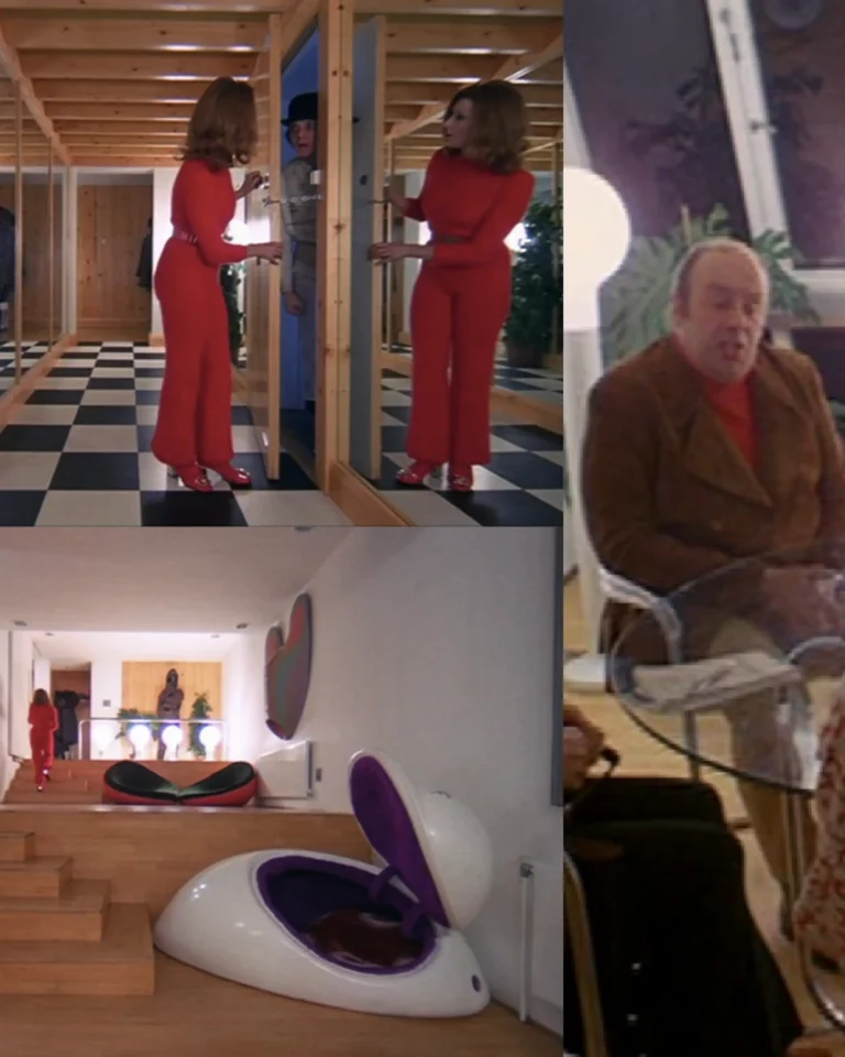
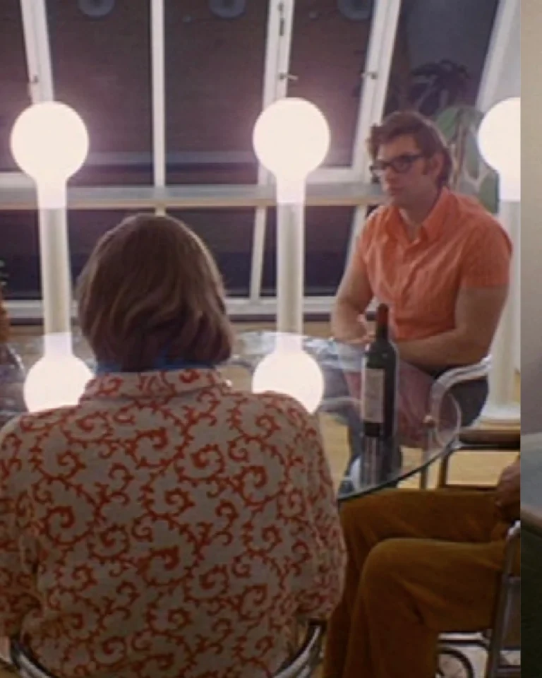
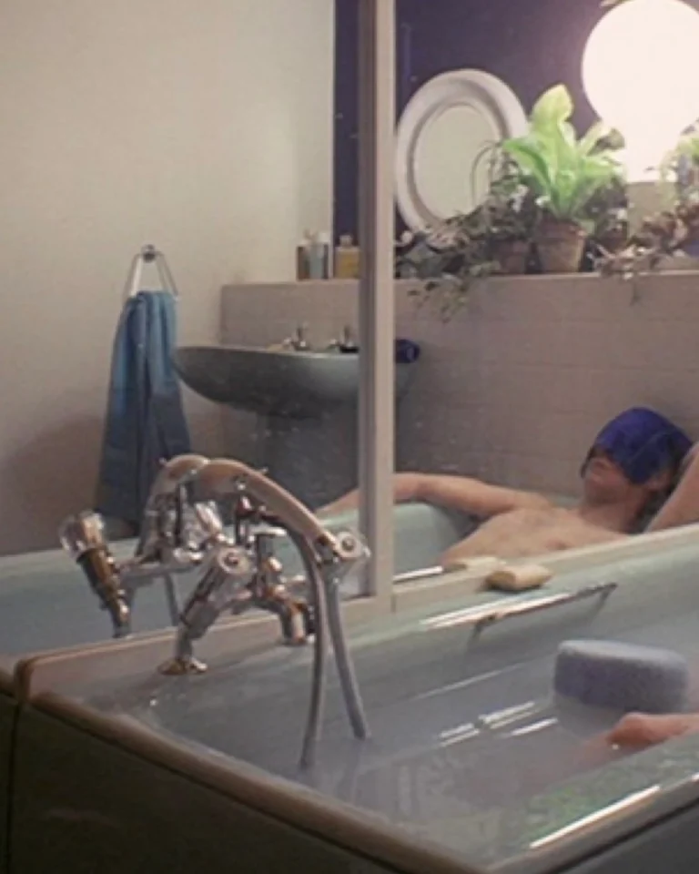
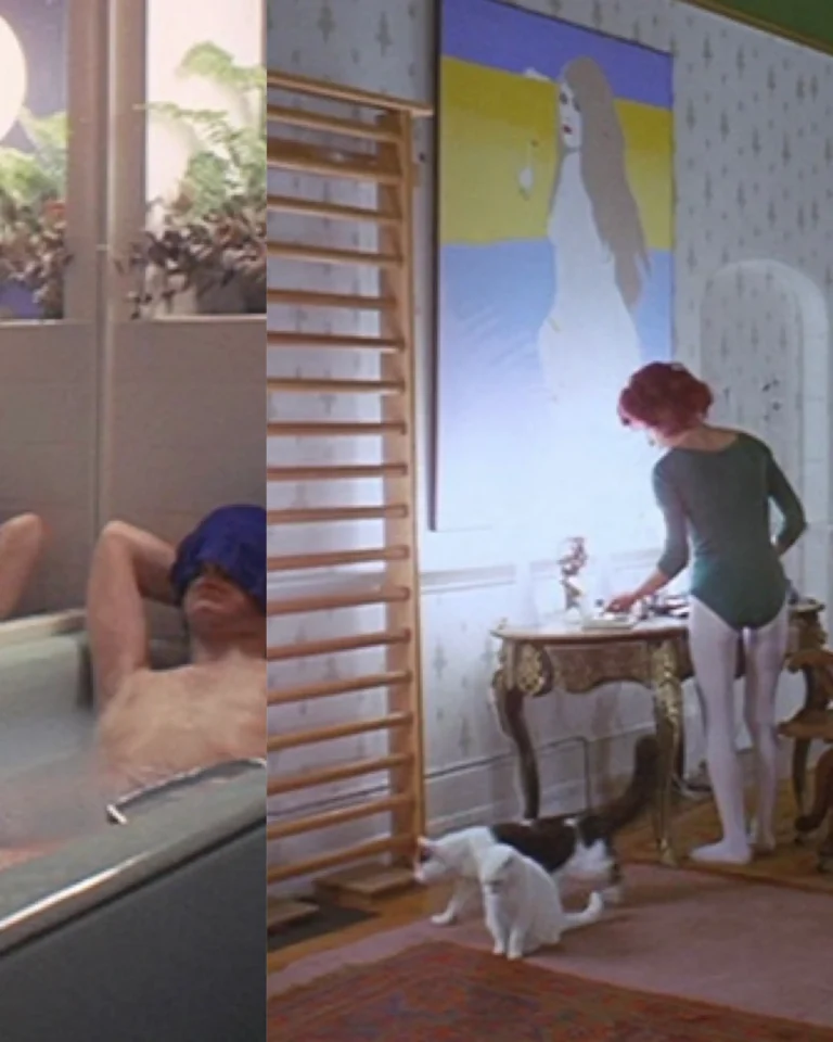
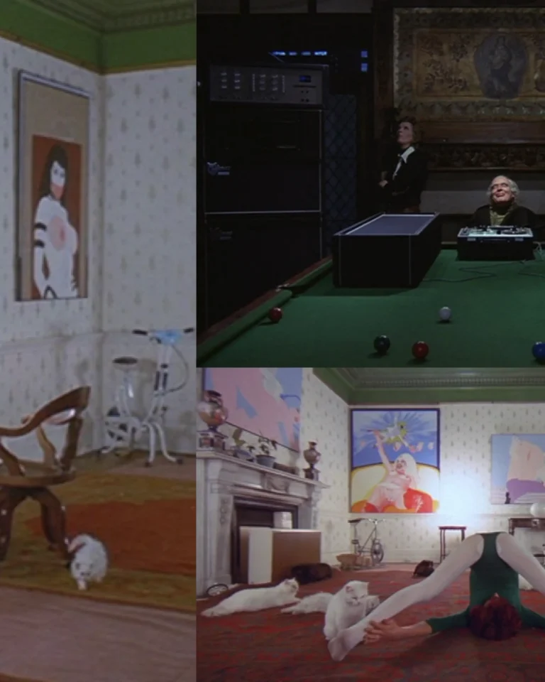
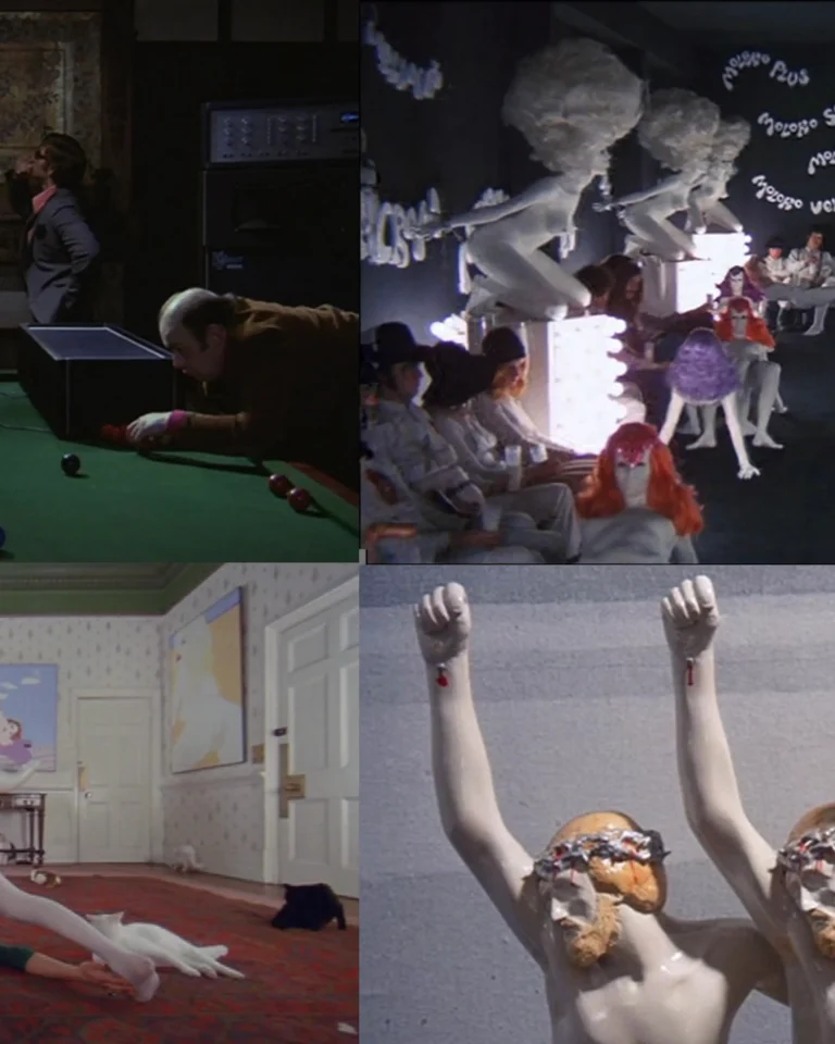
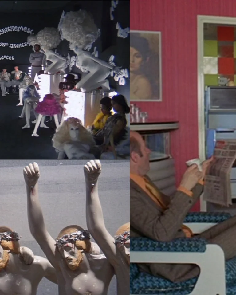
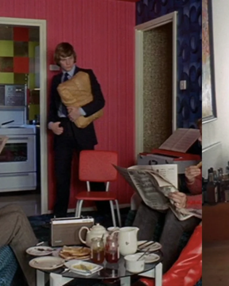
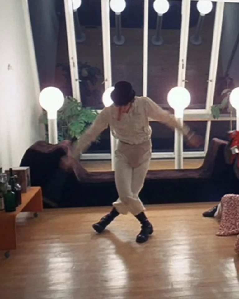
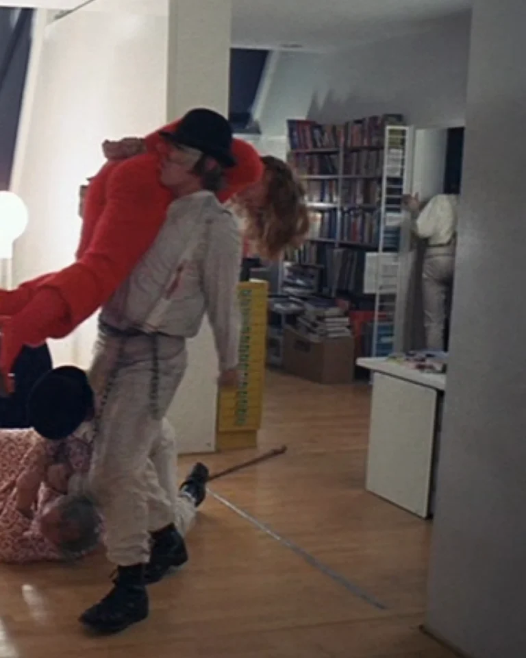
A Clockwork Orange (1971) - colour as violence, made clinical :
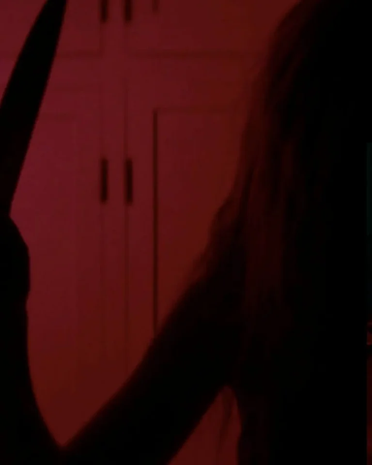
Stanley Kubrick and production designer John Barry strip warmth out of the palette almost entirely – stark whites, hard primary colours, and furniture that looks more like sculpture than anything lived-in. The Korova Milkbar is the clearest example: milk-white walls and furniture shaped like nude female bodies, bathed in cold light, turning a place of casual violence into something closer to a gallery installation.
Against that clinical white, flashes of red , blood, a costume, a splash of colour in an otherwise sterile frame : land with far more force than they would in a naturally lit, realistic world. Kubrick and Barry aren’t using colour to build atmosphere so much as to strip atmosphere away, so that violence reads as staged, choreographed, almost balletic rather than chaotic or human.
It’s the same underlying idea as The Neon Demon: pull the warmth out of a palette and beauty itself starts to curdle into something threatening. Kubrick just got there over forty years earlier, and pointed the technique in the opposite direction ; using it to disturb rather than seduce
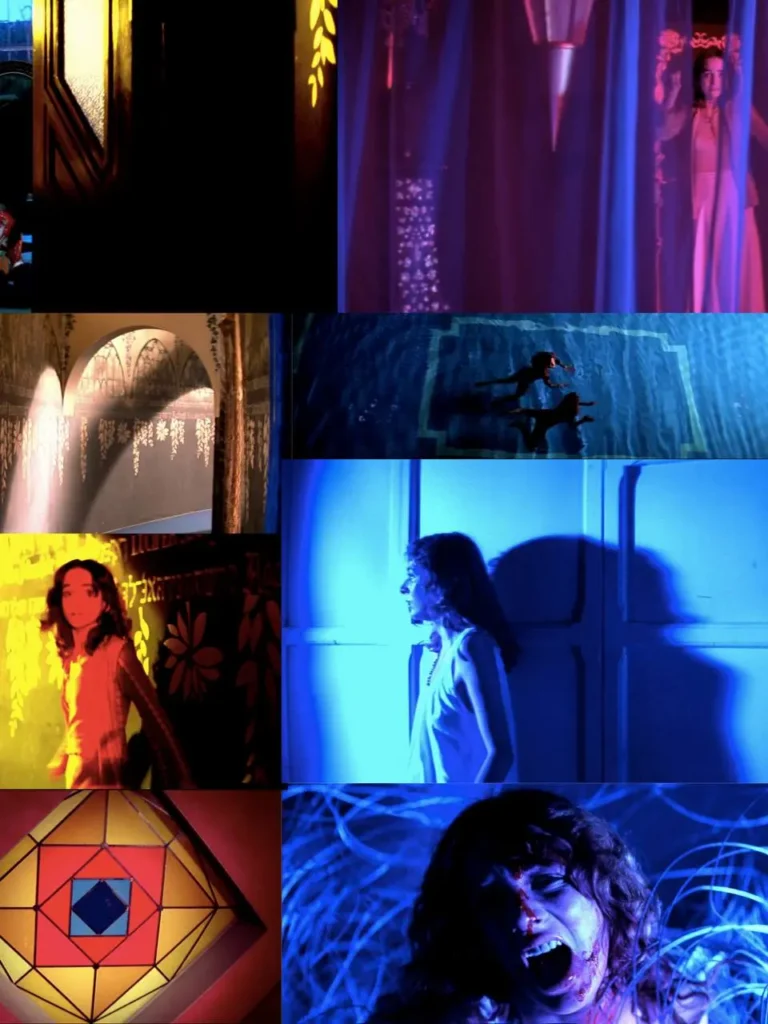
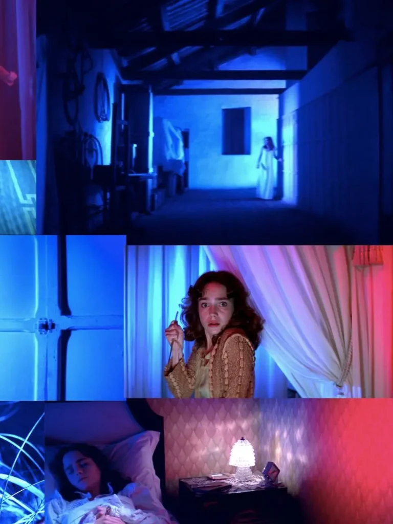
Suspiria (1977) - colour turned toxic, dread made visible :
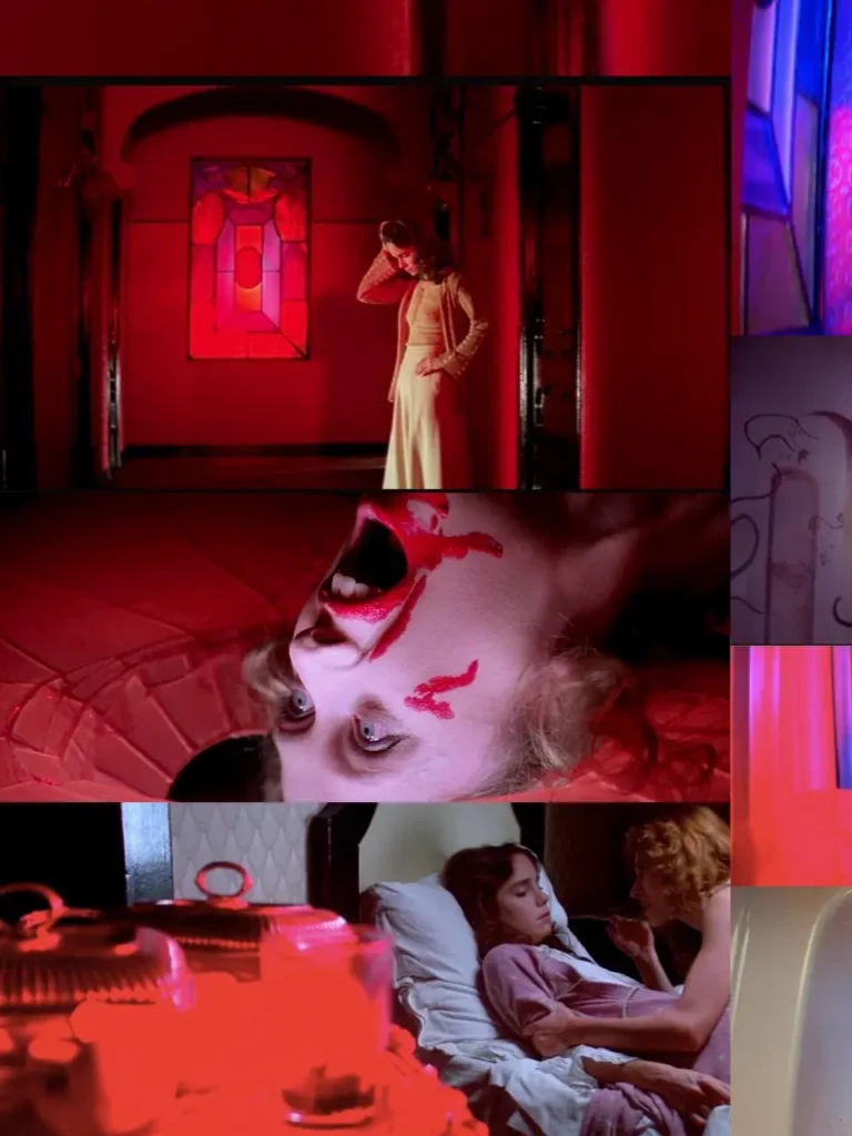
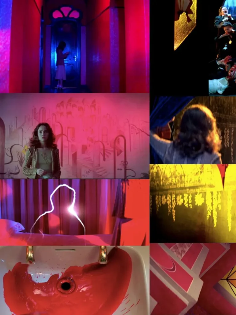
All three of the above sit downstream of Dario Argento‘s Suspiria, released just a few years after Clockwork Orange.
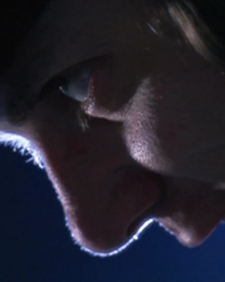
Argento and cinematographer Luciano Tovoli built the film’s look around the Technicolor richness of Snow White and the Seven Dwarfs, chasing a palette of deep primary hues against pure black. The result became a defining reference point for the giallo genre – vivid, saturated colour used to make a space feel unsafe rather than beautiful.
Nearly fifty years later, you can still see its fingerprints on how directors from Fargeat to Refn to del Toro light a room: colour that tells you exactly how to feel before you’ve consciously registered why.
The soundtracks are doing the same job :
It’s not just the visuals – the scores on these films are working exactly the same angle, and it’s worth calling out.
Alexandre Desplat‘s score for Frankenstein leans almost entirely on violin, carried by soloist Eldbjørg Hemsing, deliberately avoiding the obvious “creature” sound – no big electronic hits, no cello menace; in favour of something fragile and emotional. Same instinct as the colour work: restraint and warmth over spectacle.
Raffertie‘s score for The Substance goes the other way entirely – industrial, pulsing, and increasingly unstable as Elisabeth’s body starts to fail her. It builds the same way the visuals do: composed and controlled to start, then it starts to distort and glitch right alongside the body horror on screen.
The Neon Demon and A Clockwork Orange both go the opposite way again, and honestly they’re two of my favourite scores for exactly that reason. Cliff Martinez‘s synth score for The Neon Demon is cold, pulsing and synthetic , it makes the beauty on screen feel like it’s humming with static. And Wendy Carlos‘s Moog-synthesised versions of Beethoven and Rossini for A Clockwork Orange do the same trick Kubrick’s visuals do: take something classical and beautiful and run it through a filter that makes it feel unnatural and unsettling.
And it all traces back to Goblin‘s score for Suspiria – a shrieking, whispering, off-kilter mix of prog rock and analogue synths that Argento reportedly had playing on set to unsettle the actors while they filmed..!
Nearly fifty years on, you can still hear its fingerprints in every one of these scores: sound doing exactly what the colour does, working on you before you’ve consciously clocked why…
Why this matters to us :
This is exactly the kind of thinking we care about at The (22)Studio. Our space – including the 240sqm blackout cyclorama – exists because lighting and colour aren’t an afterthought, they’re structural. Whether it’s a projection mapping workshop or a full production shoot, the same questions a production designer asks on a film set apply: what does this colour tell the audience, and what happens if you change it?
If you’re working on something – a shoot, an installation, a workshop – where colour and set design are doing real narrative work, we’d love to talk.
By @popglitch22